WHAT
The landing page is your opportunity to create a great first impression and helps set the tone of the app. It also provides a place for users to input their location so the app can start at an extent that is meaningful and focused.
WHY
For years, builders have chosen to show a map when the app starts. Without further input from the user, the initial map extent must default to the smallest possible scale — for instance, Central Europe for any point that falls within. Typically, this results in an unacceptable UX for two main reasons: first, the user wants to view their own location, such as their state, home, or current location. Second, showing all the data at a small scale is overwhelming, feels crowded, takes longer to render, and, most important, is not relevant.
The landing page is where people start their journey with your app. It’s the place where they get introduced to the purpose of your app, and, as in real life, first impressions count. Users make up their mind in a matter of seconds whether it’s worth spending more time on this app, or else they abandon it
and look elsewhere.
Since the landing page is the first touch point with the app, it’s a great opportunity to ask users for their initial input, such as the location of interest, and then use this information to funnel them into a workflow that provides relevant next steps or even answers. Using the landing page to introduce users to the app and gather their location will help optimize the subsequent UX and user interactions with the map.
WHEN
Although landing pages are important entry points for any app, they are most often applied to focused, single-purpose, public-facing apps that are used by a wide variety of people with the goal of finding answers to specific questions. Good examples of sites that facilitate landing pages can be found in the travel, recreation, and real estate industries. The main input is a person’s location of interest, such as their travel destination or home. This information can be used to create task-oriented workflows that show more results and allow further interactions with that location.
HOW
To create a landing page, add an extra page or full-page overlay before the user reaches the actual map app. This page consists of a few elements and a generous layout with bold, emotional images, appealing typography, and concise copy.
The main measure of success for a landing page is whether a visitor becomes an active user and continues engaging with the app or abandons it. The best way to retain users is to research the target audience, understanding who they are and what they want or need when coming to the app, and offer a clear way to solve this end-user need.
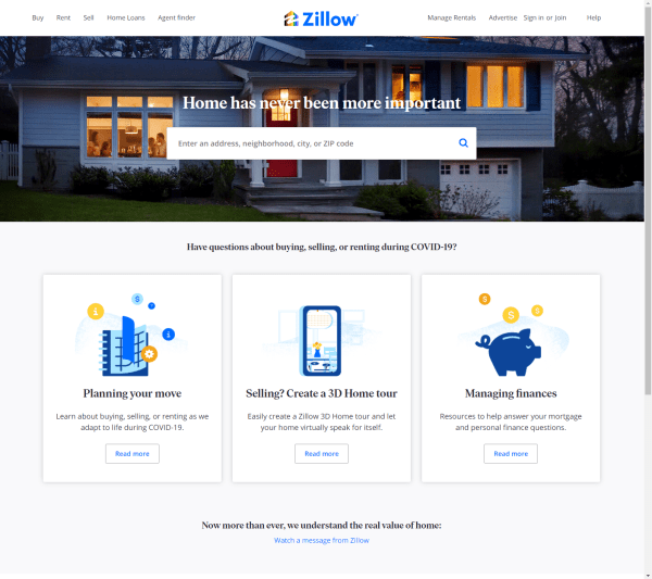
Since the goal of the landing page is to capture and funnel the user into a workflow, it needs to be brief, concise, and attractive and offer fewer distractions. Start by removing anything that clutters the UI and distracts from the main goal, such as links to external sources or global navigation. Instead, provide a clear value proposition and include critical elements such as a headline, tag line, supporting image or illustration, and input to gauge the area of interest. Good input mechanisms to find places of interest are search or location finder, and to receive the user’s location, use locate me. It’s common to place location finder and locate me next to each other in the UI. Another possibility is to provide a series of links to common locations (placemarks). These shortcuts are especially important on mobile devices in which typing search phrases can be cumbersome and annoying.
EXAMPLE
With thousands of miles of trails, the state of Ohio offers nearly endless opportunities to explore the outdoors. The aim of the DETOUR app is to prepare outdoor enthusiasts with useful and authoritative information for their next trails adventure. The app starts with a landing page that allows users to search for trails, recreational land, or cities. The landing page also lists shortcuts to popular destinations as secondary input. Both search and placemarks direct the user to the main app that is focused on the selected place. The landing page also offers a list of featured routes to spark interest in exploring something new. Selecting a place or route takes the user to a page that shows more details on the trail and its surroundings.

MORE EXAMPLES
Zillow


